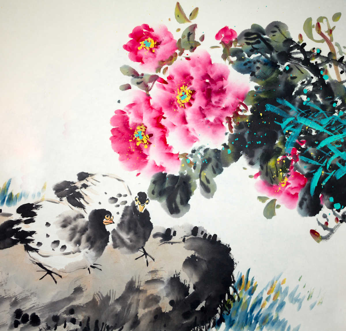
If you've downloaded a Kindle Edition of the book and see that the cover has changed, worry not! The book has not changed.
My original intention for the cover was to leverage black and white Chinese-style watercolor and keep things stark and minimalist, and that's still the vision for the paperback, but unfortunately that minimalist vision does not show up well on the Kindle app at all. One of my readers let me know it was hard to see the title and that it looked "out of place" among other books, and when I went to my own Kindle app to check out what she meant, I had to concede the point. It looks beautiful on a physical shelf:
...but on the Kindle app it was sad and tiny and white while everyone else was a riot of color with big splashy titles you could see from a normal reading distance. I am my own artist for the cover (I come from an advertising background and have access to stock and photoshop so I do the designing solo) so it made changing on the fly a little more feasible.
So, what does this all mean? The paperback will still have the original minimalist vibe with the splash of red watercolor that I initially desired to go with, but the Kindle Edition is more vibrant with a much larger title so it stands out in the tiny icon that the Kindle app allows and doesn't look anemic among all of the other titles.
Either way, happy reading!

